Case Study
Alert Management System
Alert Management System
Enhancing alert management and customer profiling experiences for banks.

Overview
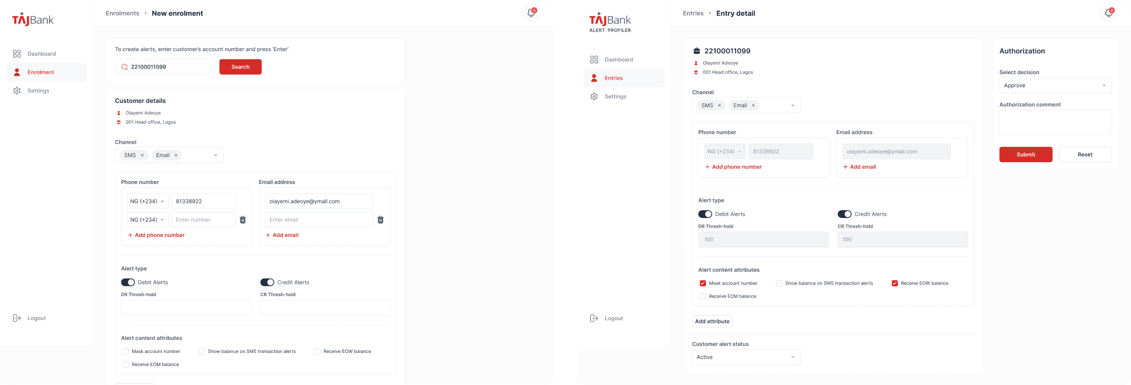
The Alert Management System assists bank staff in creating Statements of Account and transaction alerts for customers. This internal tool, exclusive to banks, streamlines operations and reduces time consumption by consolidating daily customer transactions. It automates alerts via SMS, email, or both for each transaction performed.
The objective of this project was to revamp the existing platform by enhancing and simplifying the user experience and interface, and as well develop a customized, whitelisted version tailored specifically for TAJBank.
Role
UI Designer
UI Designer
Team
2 Engineers
2 Engineers
Timeline
2 weeks
Figma
Adobe Illustrator
Approach
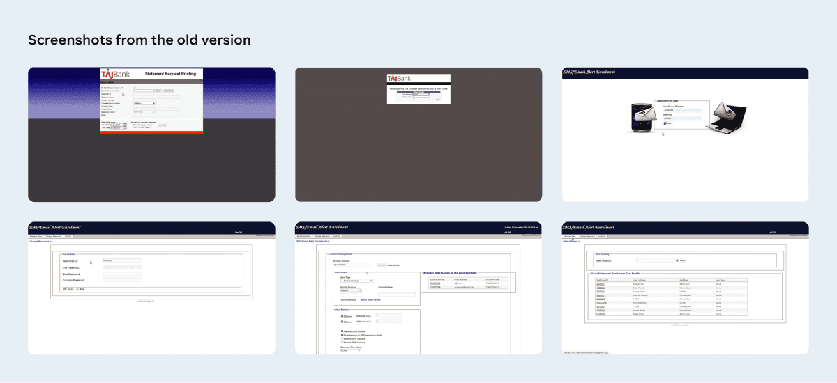
I conducted an interview with the stakeholders and tested version 1.0 of the platform to understand its flow, identify pain points, and suggest suitable user experience solutions. Stakeholder feedback revealed that users desire an app that is visually appealing, easier to navigate, and efficient enough to maximize productivity.
To address these needs, I designed a new information architecture to effectively organize the various flows and functions for different user types. I then developed user flows for these distinct functions within the app.
Subsequently, I created wireframes, established color and text styles, and developed a component library to guide the design and development of high-fidelity screens. I proceeded to design the high-fidelity prototype and conducted usability tests during both the wireframe and high-fidelity design phases to validate the product prototype.
Information Architecture

Alert Enrolment flow
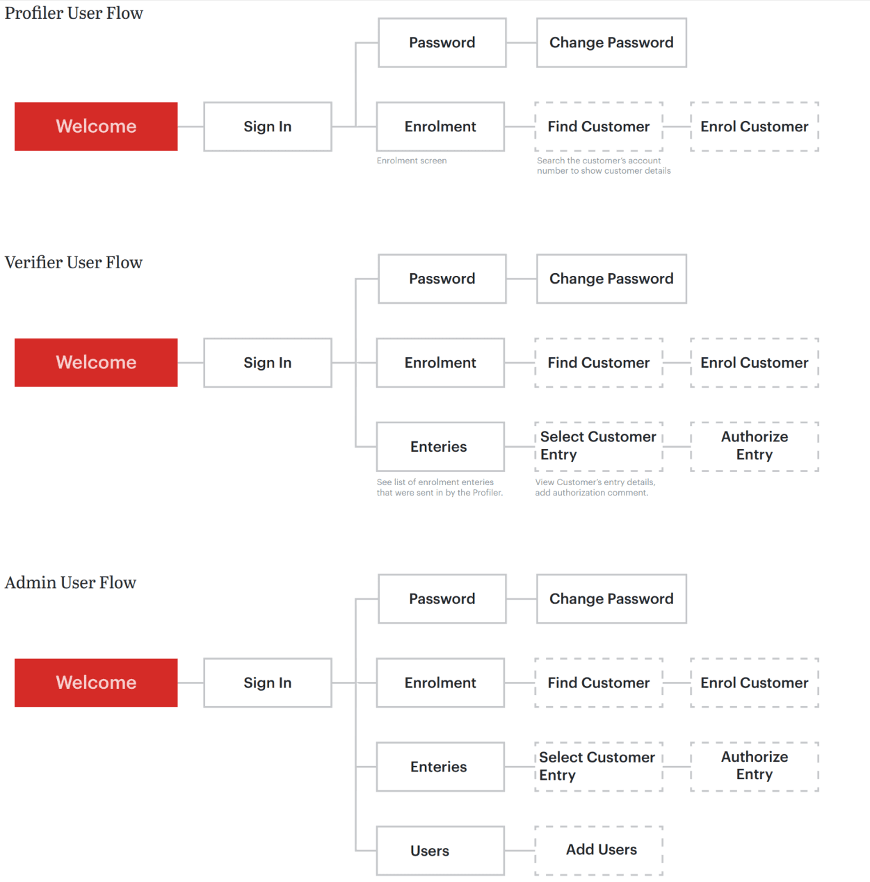
Account Statement flow

Ideation and Prototyping
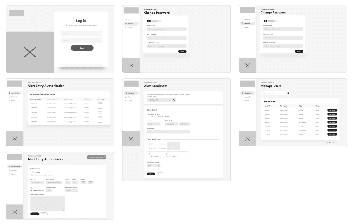
I designed low-fidelity wireframes to quickly iterate various options and layouts, allowing me to explore and refine ways to enhance the overall user experience.
I designed low-fidelity wireframes to quickly iterate various options and layouts, allowing me to explore and refine ways to enhance the overall user experience.
Colors, Typeface and Icons
Since this project is whitelisted for TAJBank, I incorporated the bank’s primary brand colors and introduced a subtle faded blue to enhance the visual hierarchy. For typography, I used Open Sans, a versatile Google font known for its range of weights, which significantly improve readability and support the visual structure.
Since this project is whitelisted for TAJBank, I incorporated the bank’s primary brand colors and introduced a subtle faded blue to enhance the visual hierarchy. For typography, I used Open Sans, a versatile Google font known for its range of weights, which significantly improve readability and support the visual structure.

Auhth screens

Admin Dashboard and Logs screens

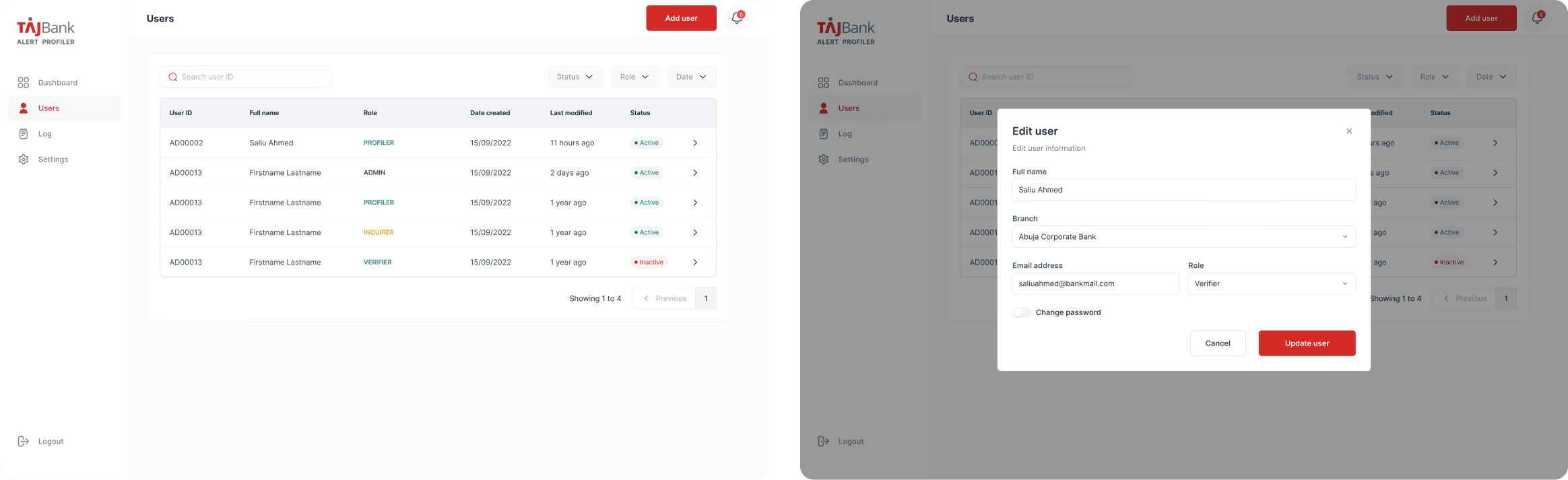
Users screens
Alert Enrolment screens